I think that the whole River Styx theme suits it more than the scene of the main character looking over Paris. I also think that the dark colours add to the effect of the whole 'die for me' title. The blue dress and the red boat also makes the girl in the centre stand out. Anyway, that's just my opinion. What do you think??
 |
| OLD US COVER |
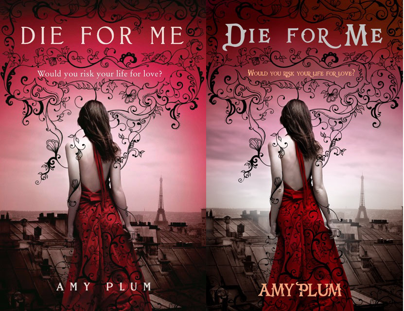
The US now has a new cover, as seen below on the left, but I still preffer the old one... - Why did they ever get rid of it?? -
 |
| NEW US COVER UK/AUS COVER |

2 comments:
:( Sorry to burst your bubble but the US cover that you have is actually not available. It was the original cover but they changed it at the last minute to the one you have for UK/Aust. The UK/Aust one is the same except that the title font is more swirly. You can read all about it here: http://www.amyplumbooks.com/2011/03/die-for-mes-new-us-cover/
I originally really liked the dark blue cover but then I saw the new cover and fell in love with it. That said, I think the swirly writing on the UK/Aust cover is a little bit overkill so I like the new US cover.
Haha I've become obsessed with these covers hence my long message! Great seeing you today :)
i don't like the yellow writing on the read back ground. it's nce apart from that.
she has a great name... amy plum. i wonder if she's ever killed someone in the sitting room with a candlestick.
Post a Comment